KesselsKramer came first
After my studies I applied to Fabrica in Italy and to KesselsKramer in Amsterdam. KesselsKramer invited me for an interview soon after – and I was thrilled. Fabrica’s yes arrived half a year later. By then Amsterdam had already become my home, the one I had chosen.
I drove to Amsterdam with friends, and suddenly I was sitting on a sofa in a church next to Erik Kessels, being introduced to what felt like everyone in the building. I left with a job offer. I stayed for seventeen years. My children were born there, and a few of my closest friendships began there. Looking back, one project holds that whole time together for me: I amsterdam.
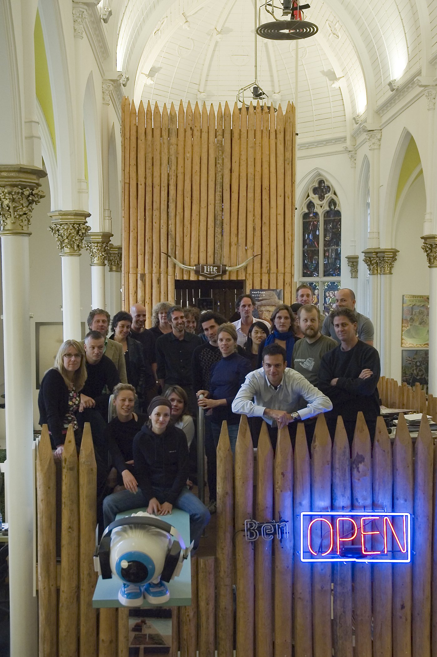
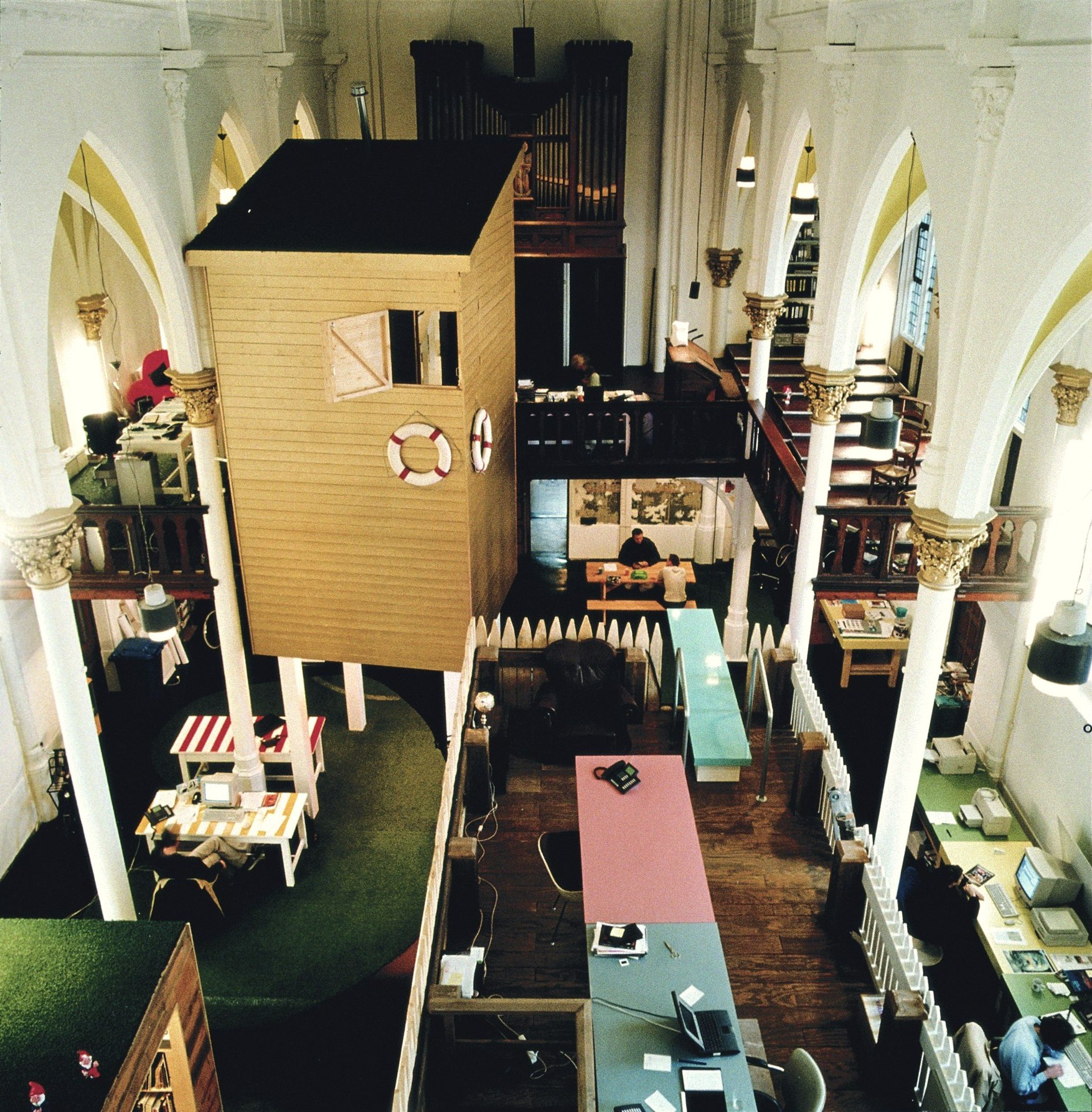
KesselsKramer, working in a church on the Lauriergracht, Amsterdam.
A bed at the Hans Brinker
The agency even organised my first flat. Until I could move in, I slept at the Hans Brinker Budget Hotel – the hotel KesselsKramer had made famous by promising, proudly, to be worse than you expect.
One of my first jobs was the pitch for Amsterdam’s new city marketing. The city felt it was falling behind. London and Paris were on everybody’s map; Amsterdam was known abroad mostly for sex, drugs and parties, and had tried slogans like “Amsterdam has it” and “Cool capital” that never stuck. The city wanted a place among the great European cities again, and the campaign was meant to be the first step.
Same idea, one domain
I was allowed to help shape the logo for the pitch, together with Erik, and I fell in love with the manifesto Tyler had written for it. I still have it.
Ultimately, Amsterdam’s strongest asset is its people: the people who live here, the people who work here, the people who study here and the people who visit here. The people of Amsterdam are Amsterdam. […]
“I choose Amsterdam for business. I choose Amsterdam for education. I choose Amsterdam for inspiration. I choose Amsterdam as my home. I am Amsterdam.”
For the pitch, we also made a short film with the same voice.
Then came the pitch. Erik has said it on stage himself: we were not the only ones with the idea. Frans van der Avert, who led Amsterdam’s city marketing, later said that three of the four agencies pitched essentially the same concept (DNCO). What we had that the others did not was the domain. The internet was still young, and we had secured iamsterdam.com. As far as I know, that was what tipped it.
Building a city’s identity
Only after we won did we finalise the logo, and I worked on the many applications that followed. I developed the corporate identity: where the logo lives, how it is used, what it may and may not do. Identities were simpler then. Nobody spoke of 360-degree campaigns yet; that came much later.
From the start we asked how you represent a city whose landmark is its people. The answer became an exhibition: eighteen photographers, among them Koos Breukel, Dana Lixenberg, Hans van der Meer, Bert Teunissen and Henk Wildschut, were invited to portray Amsterdam and Amsterdammers. The same portraits went onto posters and billboards across the city, each with the red band and the logo. Part of it was a book, which I designed. I remember how much I enjoyed thinking about paper – the short pages tucked inside the book that people loved, and how beautifully the print came out on the textile cover.
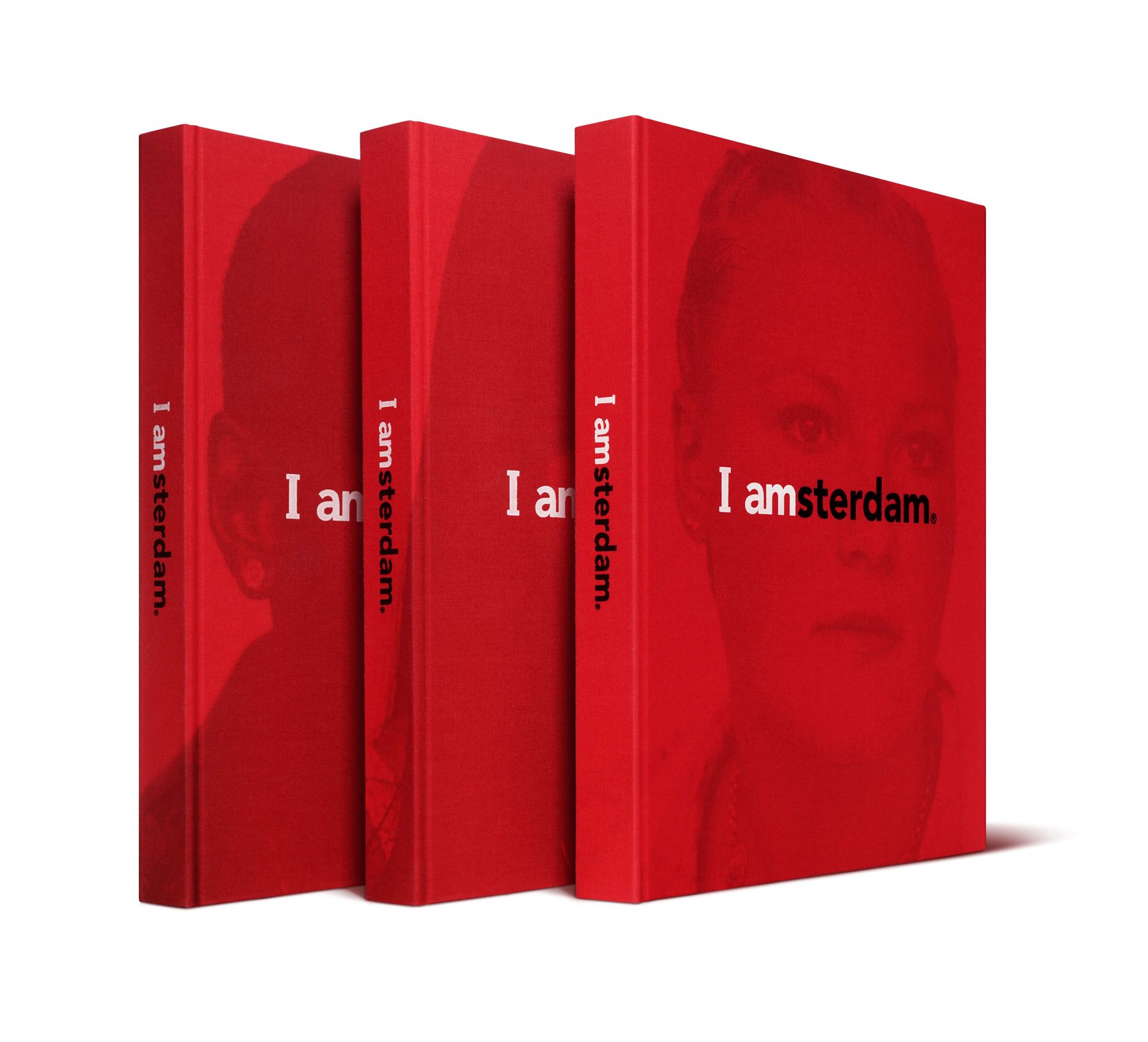
The I amsterdam book, bound in red textile.
I amsterdam launched in September 2004. The first exhibition opened at Foam, Amsterdam’s photography museum, and the whole agency went together.
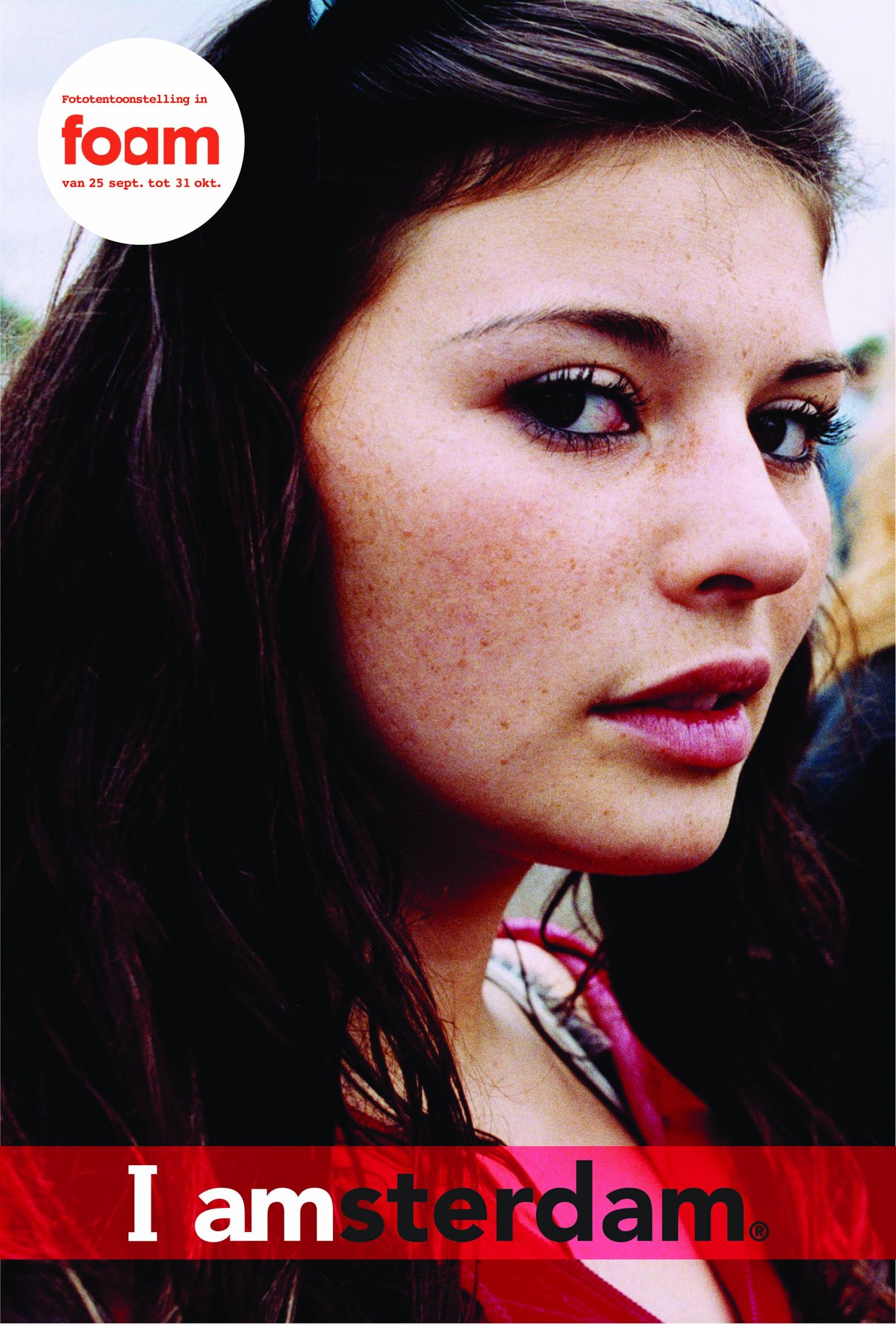
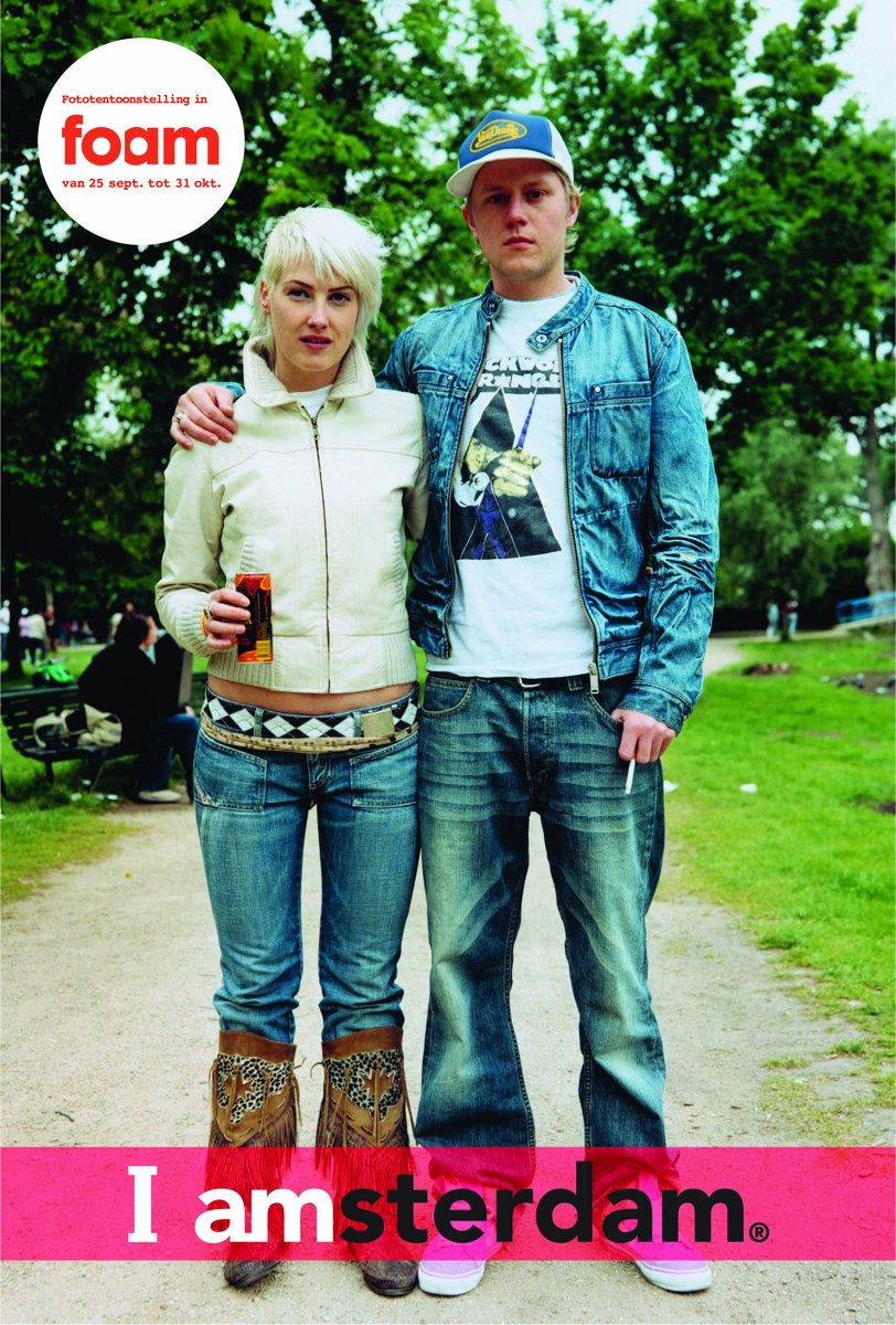
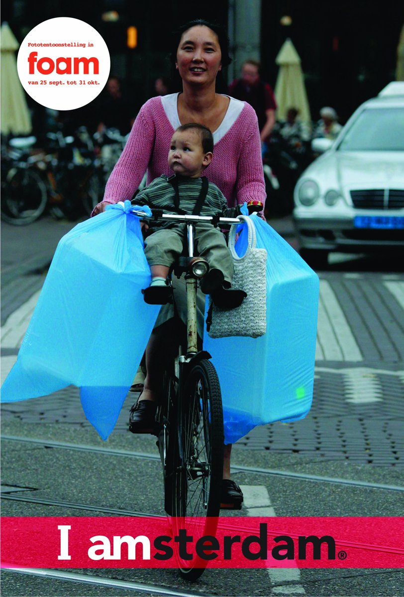
Posters for the exhibition at Foam, 25 September – 31 October 2004.
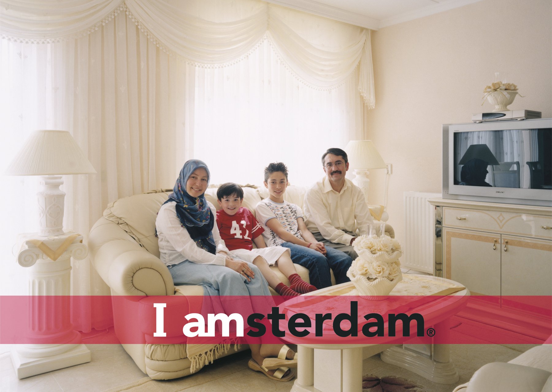
Billboard. Photo: Bert Teunissen.
Living inside the brand
I only really understood what we had made when it came back to me as a citizen. When my first son was born, the city sent a small bath towel with the I amsterdam logo embroidered on it – as far as I know, every new Amsterdammer got one. When friends asked me for tips and I went to the tourist office to collect information for them, I was handed an I amsterdam keyring. It is still on my keys today. And then there were the letters on Museumplein: two metres high, red and white, always crowded.
You only see in hindsight how much a city changes around you. I measure it in coffee. When I arrived in 2004, most cafés served filter coffee from Douwe Egberts. Over the years specialty roasters moved in. I watched Lex serve coffee at Headfirst on the Westerstraat. Later he and Dylan started their own roastery, Friedhats, in a garage that opened onto my own courtyard – “a garage, two guys and a coffee roaster”, as they put it. I still order their beans from Amsterdam, along with those of Lot Sixty One, which opened on the Kinkerstraat in 2013.
The crane
On 3 December 2018, early in the morning, a crane lifted the letters off Museumplein. In half an hour they were on a truck. The proposal had come from GroenLinks, the largest party in the city council. Its leader, Femke Roosma, said the slogan had become a symbol of mass tourism and individualism in a city that stands for solidarity and diversity (DutchNews, Dezeen).
For me it remains one of the clearest examples of typography turning political. Two words, set in three-dimensional letters, had stopped being a logo and become a statement people argued about – “I” instead of “we”.
The irony is that in the manifesto, the “I” was always meant as “we, the people of Amsterdam”.
A little while after the letters, I left Amsterdam too. We moved on 8 February 2021, the morning after Storm Darcy had brought the first snowstorm to the Netherlands in eleven years.
Outgrowing its makers
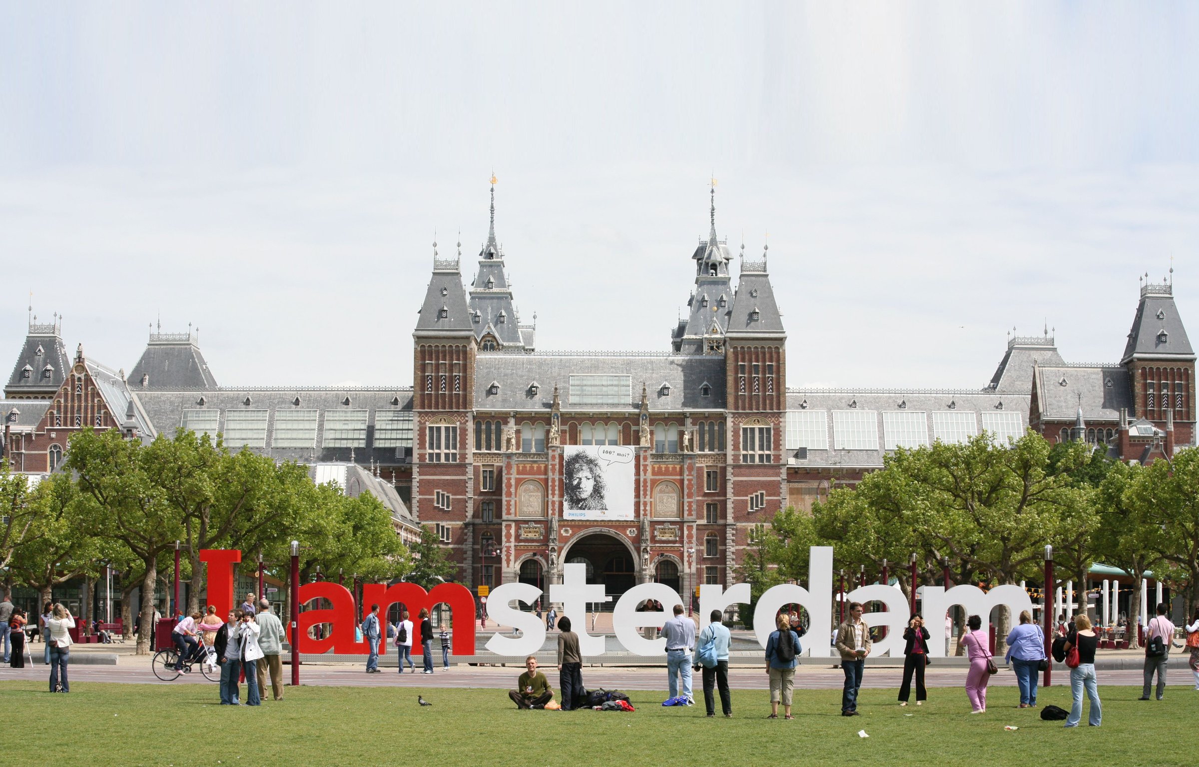
The letters on Museumplein, in front of the Rijksmuseum.
By the numbers, the letters became one of the most photographed spots in the city: Amsterdam Marketing estimated around 6,000 selfies a day (Business Insider). Copies appeared from Odessa to Somalia (Fonts In Use). And the city grew: hotel nights roughly doubled within ten years, from about 8.3 million in 2008 to 16.7 million in 2018 (Statista, based on city figures).
I would be careful to claim all of that for a logo. Cheap flights, Airbnb and a dozen other forces pushed in the same direction. But I do believe design gave the city a picture of itself at the moment it needed one. The best proof of its power may be the crane: you only remove what has become too strong.
From Amsterdam I learned that design can set things in motion that outgrow everyone who made them. It taught me much more than that. These days I enjoy looking back at the things that started my career through the lens of transformation. Change rarely shows itself while it happens. You see it afterwards. Seventeen years, two children and a keyring later, I am still learning.
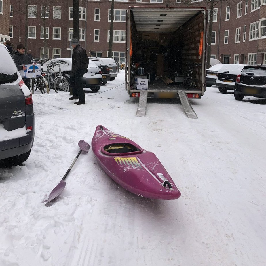
Moving day, 8 February 2021.